This is an essay on the proper markup for abbreviations and acronyms in HTML. If was first published as a series of posts on Yammer, but since we will discontinue the use of that tool, I thought I rather save it over here (it’s probably more accessible here anyways).
A word of warning: this is a long and complex topic and in the end there is no clear “one size fits all”-kind of answer. If you can’t stand this (as some people seem to), do not read on.
Pronunciation matters
Back in HTML4 we still had two distinct tags to mark up acronyms (using <acronym>) and abbreviations (using <abbr>). This distinction ended with HTML5, which ditched the <acronym> tag and only allows for <abbr> to be used for both, acronyms and abbreviations.
Well, you may think: these two are really synonyms and there is no clear distinction between them anyway. Or at least so I thought in the beginning, but I soon found out that I was wrong.
Some sources make a distinction between these terms on how they were formed, distinguishing between words that were formed by putting together the first letters of a multi-word phrase (e.g. “light amplification by stimulated emission of radiation” has become “LASER”) which are called initialisms whereas terms which come from simply leaving out parts of a word (e.g. “Mr” for “Mister”) which are the original abbreviations. From this point of view, both initialisms and abbreviations are acronyms.
For web-publishing it is of little importance what a word is derived from, but for very practical reasons it would be useful to make a distinction on how these words are pronounced (if you wonder why, I’ll come back to that in a moment).
Consider the following terms: NATO, laser, radar, AIDS, GIF, Interpol, GNU, …
And compare them with the following: EU, ASAP, DIY, USA, …
The difference is of course that the first group are all “pronounced as words” whereas the latter are spelled out (e.g. as “D-I-Y”).
It doesn’t matter how you call these (and some people like to call the first group acronyms and the second abbreviations), but as a responsible webmaster you need to make a distinction between them, at least in the interest of people using a screen reader (which has to pronounce them in the proper way)
The <abbr> tag would normally be a good starting point to make this difference, and a first thought might be to simply tag all words that should be spelled-out with it and leave anythingthat should be pronounced like a word untagged.
After all, you can specify this in CSS by using speak-as: spell-out;, which seems like just the perfect match for abbreviations. In fact, this is what the specifications say:

Clearly, whoever wrote this was blissfully unaware of any distinction between the different acronym types. No wonder then that this is not a part of any standard-implementation of the <abbr> tag in any browser that I am aware of; All of them will simply speak any term they find tagged in such way as if they are regular words (obviously often failing to produce any intelligible word in this way).
This makes sense, of course, as the weak and unclear definition of the <abbr> tag will lead users to simply tag anything that looks like an abbreviation indistinctively with the same tag (or most often: don’t use it at all).
That shouldn’t keep you from adding this to your style-sheet, though. But read on, there is more to it…
Typography matters, too
A common best practice for typesetters to, well, typeset abbreviations (or acronyms) in printed text has been to set them in sᴍᴀʟʟ cᴀᴘs (maybe with some extra letter-spacing). Note that I would not recommend this in web publishing (more on that later), but let’s first read this:
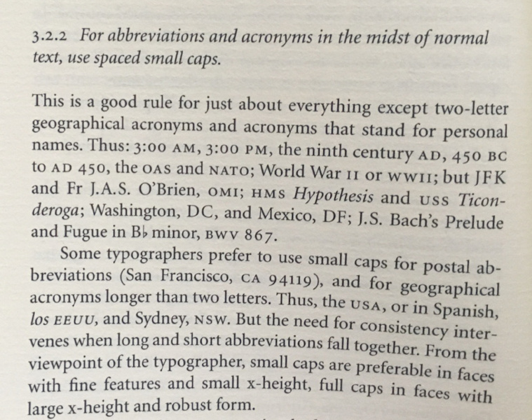
Now, the trouble is that webmasters don’t typically have access to “proper” small caps. These are normally a feature of professional typefaces and it is unlikely for the clients to have them installed, or at least you can’t (and shouldn’t) rely on them to be present.
When you use the CSS instruction font-variant: small-caps; the web client really just transforms all lower-case letters to their upper-case equivalents and then reduces the size a bit. The result is quite ugly.
Let’s have a look at a close-up to see the difference between “real” and “fake” small caps:
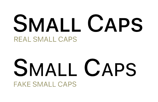
In a side note: small caps also have a lower legibility rating than regular (lower-case or mixed) letters, and in the way we want to use them here it is probably even lower than ALL CAPS, but that is an entirely different issue; No need to make them also ugly on top of hard-to-read.
As a modern web designer, you may be inclined to solve this by using web fonts – and in many situations this might even be a good solution; in others it isn’t. One of these “others” is when you have a massively multilingual web site where you may have two dozens (or more) of different languages to take care of so that the font file would need to be rather heavy to cater for all these different characters you need. Remember that when your site visitors have to wait too long for your web page to load, they may be off and away before they even get to see what you have to offer.
Not to mention even that ugly “font flicker” that happens when the page is updated after the font file was finally loaded. This also gets more pronounced (and more disturbing) if the font file takes longer to load.
Last but not least this solution doesn’t degenerate well: what if the font file could not (for whatever reason) load? Then you have terms like “nato” or “eu” in your text which are a lot less comprehensible than the properly upper-cased “NATO” and “EU”. In short: don’t do that.
There is yet another option that you may be tempted to use (but shouldn’t!): there are a couple of “Unicode Text Converter” scripts out there which promise to convert any (English!) text and convert it to “Unicode Small Caps” characters.
Unfortunately, there are no “Unicode Small Caps”. What these tools really do is replacing all the lower-case characters with a collection of other Unicode characters (mostly from “IPA Extensions” and “Phonetic Extensions”) that look like small caps characters. And there is a lot wrong with that.
Firstly, the semantics of your text is messed up. Instead of the term “NATO”, which is something people may look for on the Internet or by using the in-page search function, your text now shows “ɴᴀᴛᴏ”, consisting of special characters which may or may not be recognized by search engines or browser functionality.
In fact, there is also no guarantee that all web clients can display it properly (hint: Safari under iOS and Chrome under Android seem to have problems with many of them…). And even when the can be displayed they often look different than the rest of the text and/or inconsistent even within the word itself.
Oh yes, and of course there’s no support for accented characters. You are limited to English-only in that case.
In other words, don’t do that either.
However, even though typographers really love to use sᴍᴀʟʟ cᴀᴘs for abbreviations, there are some other “tools of the trade” to deal with them.
Let’s consider the actual problem that the small caps are supposed to solve: it is that UPPER-CASE letters are designed to appear in singles, as the first letter of a sentence or particularly important words (proper nouns) to mark them out. Setting them in chunks together makes them too massive and dominant and they tend to dominate the entire paragraph.
However, even the tiniest modification of the font size can already counter this effect. The trick is to find a size that is small enough to remove at least some of this dominance without introducing a visible reduction of the stem size which would disturb balance of the typeface design.
I have tried around a bit with this, and found a good compromise at 95 % text size. Have a look at the following to see the difference (its an animated GIF, if it’s not moving, try to download it…)
You can see that the difference is subtle but significant. The precise amount by which the size should be reduced may differ, depending on the actual typeface used, but make sure to keep it subtle.
The title attribute
But coming back to HTML: there is one important aspect of the <abbr> tag that we shouldn’t forget: it’s “title” attribute.
The “title” allows you to specify a mouseover text, i.e. a text that should be displayed when the user hovers the mouse pointer over the text.
In theory, it can also be used to provide an expansion of an acronym that screen readers can read instead of the abbreviated text. To my knowledge, this is however not supported by any screen reader at the moment – and if you think about it, it is probably not a very good idea in any case…
It should also be clear that obviously the mouseover text can not be accessed on devices which have no mouse pointer – like on tablet PCs and smartphones, so it is of little use there.
However, where it can be accessed – like, on PCs and laptops – it can be a very good help for the user to understand the sometimes rather cryptic acronyms that may appear on your pages.
So it remains a good practice to provide these text alternatives for those who can and want to use them. Especially if the abbreviations are rather less well-known.
However, in many cases it is quite sufficient (if not even preferable) to expand the abbreviations once in the text and then just use them without a title attribute. That is up to the editor to decide.
The above also means that there are well-known and established acronyms that do not need to be expanded. Most people know what USA means and therefore it’s expansion “United States of America” is probably superfluous and not very helpful in any way – on the contrary, it increases noise on the page and thus makes it overall less comprehensible.
Wrapping it up
Markup
Let’s collect all the different issues and see how they can be dealt with. I’ll use a new CSS class named spell-out in these, which I will explain later. Of course, you can name these any way you like:
- Abbreviations that have become proper words (examples: radar, laser, Interpol): Simply use them like any other word, no special markup needed.
- Abbreviations that are spelled in ALL CAPS but pronounced like words (examples: NATO, AIDS, GIF): Tag them with
<abbr>, add an expansion in thetitleattribute, when appropriate. - Spelled in ALL CAPS and spelled out letter by letters (examples: ASAP, DIY): Tag them with
<abbr class="spell-out">, usetitleattribute to expand if appropriate. - Abbreviations that are commonly known and understood (examples: EU, USA): Tag them with
<abbr>, useclass="spell-out"if pronounced this way; Notitleattribute needed. - Mixed-case abbreviations (examples: LoRaWAN, MiFID): Use
<span>instead of<abbr>here, but otherwise the same rules as above apply (note that there is no good solution in terms of how to pronounce these for many of these).
Adding Style
Secondly, let’s add some CSS to make it behave how it should:
Firstly, since the “spelled out” is now a class and no longer attached to the <abbr> tag, it can simply be defined as:
.spell-out { speak-as: spell-out; }
Secondly, since the <abbr> tag is only used for upper-case terms, these can be displayed with a reduced font size:
abbr { font-size: 95%; }
Last but not least, those <abbr> tags which have a title attribute (and only those!) should get a dotted underline to indicate that there is a mouse-over text available. The same could be done to <span> tags, where appropriate:
abbr[title], span[title] { border-bottom: 1px dotted; }
This leaves only the case of the mixed-case abbreviations (like LoRaWAN) for which I can’t really see any clean and easy solution. Any ideas (short of splitting it into several words?)